I'll start right away with the things I enjoy in v5:
- The design right now looks pretty damn good. It's a nice mix of the familiar old design and the new one, which is already looking awesome! It's somewhat more of a minimal and much more neat design which is good.
- The karma bar on everyones profile is a great idea. Now that up- and downvoting has finally a use (don't know what it affects in the old version)
- The responsive website - and therefore the mobile design - also looks really neat and clean. That's what was missing for a long time, but now you can browse ModDB on your mobile phone!
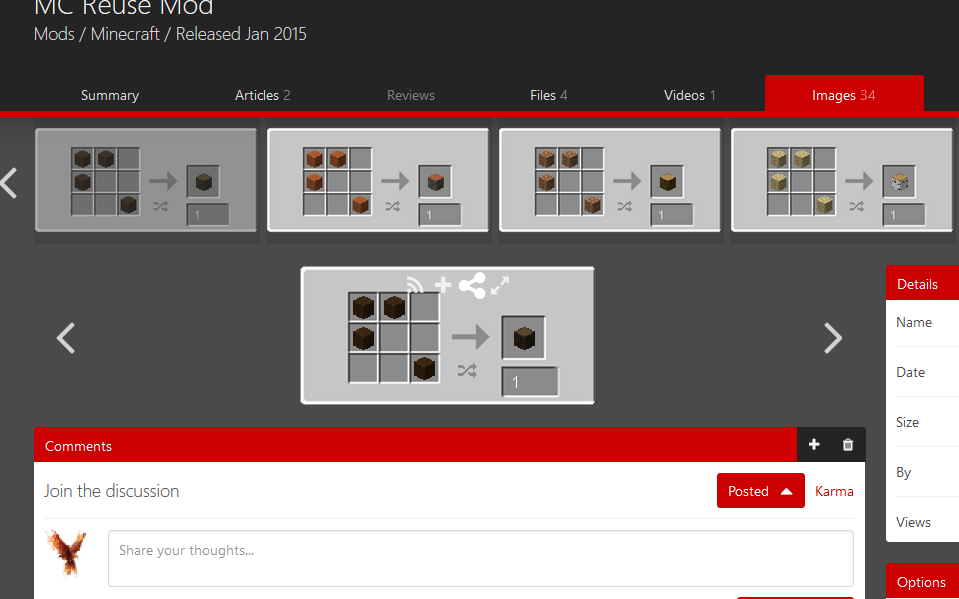
- I like the new image gallery on Moddb.com. Really modern and clean looking. If it was my decision I wouldn't change anything there for the final version.
There are also some small changes in detail that I think are really awesome... (and should definitely be included in the final version):
... Next to your profile categories (images, videos, files, etc.) are now numbers to show how many elements it contains e.g.: Members 4 , indicating that there are 4 members in this group. (How awesome! :D )
... The size of files is now also shown on the thumbnails. This isn't really needed but a really nice new feature.
... The same is true for the amount of people in a group now shown on the group's thumbnail!
Now let's go on to the things I would improve:
- The most important one is the background. To be honest, it looks boring if there are no ads (like on the landing page) and there is just this plain gray. I know that this was already a thing before v5 (simple black), but maybe choose some background image like one of those Toptal.com(no advertising, just to show you some examples).
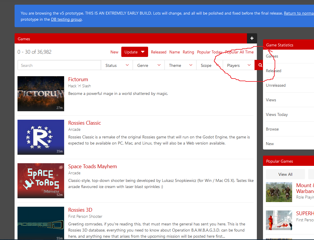
- The following applies to all pages of this kind... on Indiedb.com you can filter by release date. But if I have the opportunity to do so, it would be great if there was actually release dates showing up next to the games and mods profile. (Like when I click to filter by update)
- Some smaller change: Show the profile picture next to the username above the navbar like on Indie DB.
- Optional, I actually don't know if it would look better: A small border (1 or 2px) around the preview images of games, mods and groups.
- The controls of profile's image galleries are a bit messy. If it's white on white, you can't see anything and somehow they look like they aren't the same size. Screenshot:
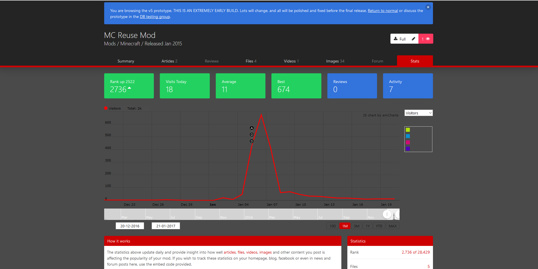
- Also the graph on the stats page (on all of the mod and company profiles) doesn't look that nice. The info boxes on top of it are awesome but the graph itself is a bit obscure. Maybe grant it some brigther background? Would be great! ;) Screenshot:
- Maybe add some functionality to the content editors? (for articles and forum posts) Something like custom font sizes, colors and spacings would be a nice addition. People who don't know how to insert custom CSS would get the opportunity to make prettier profiles.
- You should be able to give audio files a thumbnail or otherwise there shouldn't be those huge players in black like here:
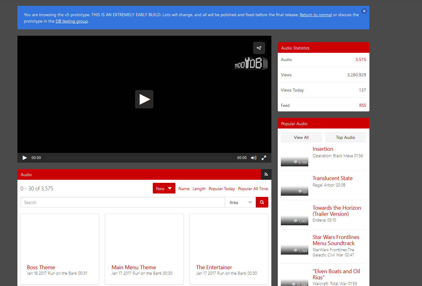 I don't know if it's easy to add a sound visualizer, but that would definitely upgrade the site experience!
 - The karma + and - buttons are still a bit small and unimposing, maybe paint them red and green?
- The forum's badges still look pretty old, but I am sure you're working on new ones.
- The thread watch page is rather hidden, maybe add it to the message center?
- Badges for dev members with their job showing on their mod's profile when they reply to stuff. The suggestion was made by @cdtfox here.
- The forum post editor is quite intrusive and there isn't much space between the different elements and the content. I came up with a nice Paint drawing to illustrate separating lines and borders around the quote and edit links (-> buttons):
 (Please don't sue me for my miserable Paint skills.)
- Last but not least: add the "Read More" button to all of the profile pages. (I'm sure you want to do that anyways)
Now it's time for... a nice bug report!
I know this is an extremely early alpha and you may already know all of these bugs, but who knows. Maybe I show you one that you didn't know. :)
Btw, although this is most likely a pre-alpha of a pre-alpha it's working pretty damn good! Most of the stuff already runs smoothly!
- Firstly, the footer is not aligned to the bottom, there is always a small gap of about 10px.
- On this page here, the search bar escapes it's borders! Quick, get it before it beats loose!
 (again those magnificent Paint skills (I'm good, I didn't have a stroke))
 - There are some problems with custom CSS profiles not showing correctly.
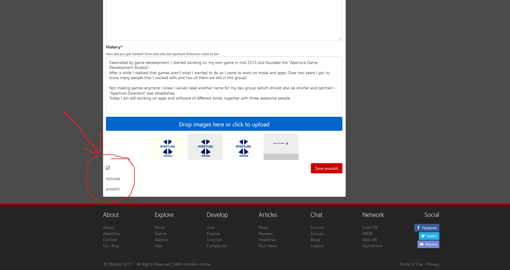
- The Activate Presskit check box text breaks into a new line without any reason:
 (No comment.)
That's everything I noticed so far. I hope I didn't waste your time explaining stuff you already knew, maybe I can even help you out a little bit with this feedback article.
Everyone else who reads this besides site staff: What are your opinions about this feedback? What would you change/fix? Tell us!

I really wanna try v5 :(
Ill give this a good read when its not 3:32 AM. Looks promising, though.
Just apply to join this group then you can try it! :)
I am part of the group :(
You now need to go to the summary and click "Enable testing mode".
They could have warned us, I joined the group when it was created (before the testing began) and have been waiting for it since.
Just started testing.
Same. I also been here since day one yes. It looks good tho, liking it so far
Personally I don't like the new design of V5. The V4 design is old-fashioned but it does the job.
This new design is just a re-skin and doesn't actually add anything new, in-fact it removes some stuff, like being able to customise mod pages CSS - something that is a core component of ModDB.
If V5 fixed some actual issues with the site like the limited ability to showcase screenshots and videos on the mod page, it would be a lot better. For now, this just seems like it is an oversimplified version of the original site. More suited to mobile than desktop.
I stick to my original feedback that I left a number of months ago before the V5 testing began, and I say that the mod pages should be more suited to the Steam layout if you're going to remove the ability to customise CSS. Make the pages feature videos and screenshots in a large area with details about the mod to the side, then further details and comments below.