Welcome to a new type of post on our blog!
This is a new type of section, in which we ask you a question! What kind of question you ask? Well, anything from design decisions to new features. Hopefully this gets you more involved with the development of CrossCode and creates a nice discussion. This means we want to use your feedback for our final decision on the given topic.
We don't know how often we will do this, so this will not be a regular thing. But whenever we feel the need of asking you, we'll make a CrossQuestion out of it!
Let's get right to it!
A new color for the shock effect
Some days ago Felix noticed that the color of the shock effect was actually a bit annoying. The problem is the contrast. We used blue and yellow to create a lightning strike kinda effect that was easily visible. But we went a bit overboard with that. When used in combat it was unpleasant on the eye, especially in the boss battle. Since players will be using every element as much as any other, we thought it was necessary to adjust the colors of the shock effects.
And this is where you come in!
We have new versions for the colors of the shock effect. And we ask you:
Which color to you like better?
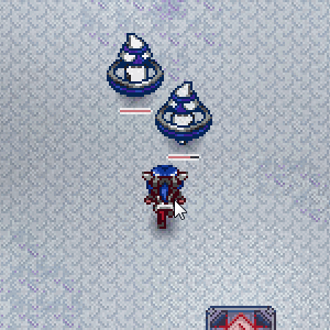
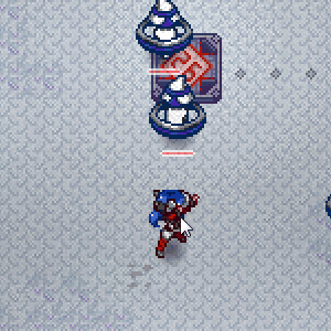
To help you on your decision, here are some comparison shots:
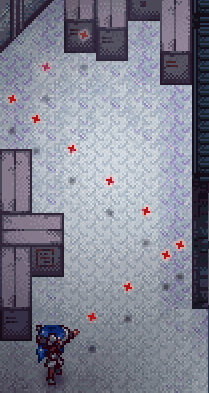
Close Combat
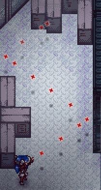
Ranged Combat

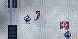
As you can see, the left/top versions are a completely new idea to the shock effect. Purple is used quite often these days but it has a very unique look to it. The right/bottom ones are a similar to the original colors but more subtle. So what you think?
Which version to you prefer or think looks good?
Let's hear all them opinions!


I like the purple a little bit better because it's a bit easier on the eyes while still looking artistic. Though that subtle blue in the yellow is a nice touch. Overall though I'm going to have to say Purple (left)
Objectively, it'll have to depend on what other colors are in the game. I mean, how close are the blues of energy and the reds of fire to the purple? Is it easy to distinguish them from the purple with a single orb? If not, the yellow is probably better since it draws from a rarer panel of colors.
Purely subjectively, I like the yellow one. Very Pika :D.
Hi Mr. IHeartPie! :D
That distinction between the elements is definitely important and it is true that the distinction works best with the yellow color. However, purple can still be distinguished from cold and heat quite well. In fact, we changed the cold effects colors to be less violet and more blue to make the distinction work better - it also looks better in the end, since a deep blue feels more "cold".
Anyway, I suppose most Pokemon fans will vote for good old yellow. :P
Purple, because purple is just way too awesome.
I'd prefer purple.
I'm diggin' the purple as well. Seems to fit better with the overall look of the game.
yea purple is the way to go
I prefer the purple visually, but if this 'shock' effect is related to electricity, you should probably go with the yellow.
I want to say I'd like the shock effect to be yellow, but the purple sprite just looks better. I think it's the color combination. The yellow is just too bright that it almost looks white, and when Lea is doing melee attacks, I hardly understand what's going on. All I see are white flashes. I might prefer a darker shade of yellow over purple.
I'd have to say yellow. I find it much easier to keep track of out of the corner of my eye.
The yellow seems to contrast a little more with the more cold-toned surroundings. It stands out a little more, but isn't really overbearing, so I'd say yellow. :P
I prefer the purple :)